Wednesday, May 20, 2009
New Skills Learnt
While we did have a list with guidelines, the best results featured my own experiementation.
My first result:
I think that this design could not go any further and could not look better because the image did not feature spaces inside, to create that 'cut out' effect.
The steps involved included selecting the image with the magic brush so I only have the image I wanted, then selecting a colour (pink) to add the spray over the top. Using the spray brush on a high diameter I placed it in the areas I wanted. Placed 'Noise' over the top to create a distorted effect, then repeated for the background by selecting the inverse. This effect looks like the spray paint has leaked out the the stencil.
My next attempt proved much more successful as I chose an image that featured the cut out white selections. I changed the interior colour from black to an off sea blue, then repeated the spraying step, however decreasing the oppacity and increasing the size of the brush. I used white over the top, yet with its decreases oppacity it looked like a duller blue. This step was repeated for the outside.
Next I went to www.brusheezy.com which gave me such a wide variety of brushes to download. i settled for a paint dripping one. I actually downloaded many rather than just one, so I used an assortment of these to create the dripping effect.
Using the rectangular selection tool I created the borders of the stencil, by using the spray brush over the inverse.
I am really happy with the result.

Wednesday, May 13, 2009
CONCEPT BOARDS
Of the three however, this was my least favourite board, having taking me the longest and I thought that it didn't fit the concept board criteria effectively enough. Therefore it came as a bit of a shock that this board was unanimously chosen to be my final concept board to present for the assignment.
This just shows that sometimes you need to listen to others point of view, as your own can be tainted by the process of creation. For example I was sick of looking at, so was unlikely to want to include it for my further assignment needs.
However, looking at it now, I can tell that it was the right choice, as this one gives me a greater variety of inspiration to work from in relation to designing skirts.
Tuesday, April 7, 2009
TORRE AGBAR
Jean Nouvel
I wasn't too happy with the first architect I found as the info I found was a bit limited.
Therefore spending a whole afternoon searching the web, I believe I have found the perfect artist to inspire me in this architectonic assignment. Just looking at the building already I can imagine how the design can translate to a collection of skirts.
The Architect Jean Nouvel is one of the most prominent designers in architecture in France today, let alone the world. While I have found many ingenious public buildings which he has design, the Torre Agbar in Barcelona Spain is the one that jumped out at me the most.
Created in 2005, it is still a futuristic, innovative building.
Not only is it truely inspirational for fashion, but its site contains a sufficient amount of images, facts, details and practical information which will make this assignment a lot easier for me.
The building is know to be inspired by the famous local Geyser and works of Gaudi, "Inspired by the architectural legacy left behind by Gaudi"
I also have images of both the macro and micro details, a concern I had was that there would be minimal information and images of the close up structure.
And the Macro...
As well as a contrast between the Torre Agbar and its surroundings..
To add extra detail and sources of inspiration, there is a differing view of the building in the day as it is seen in the night...
The only complication i have is finding large enough images of good quality that i can use on my concept boards...or finding a method on photoshop to keep the original quality.
On a comical note, I already found that this building has inspired fashion already, through the available souvenirs for tourists. This may get me started on designing my skirts.
Sunday, March 29, 2009
influential artist
Wednesday, March 25, 2009
movie posters
As soon as this assignment was mentioned by thoughts immediately went to the movie Moulin Rouge, directed by Baz Luhrman and starring Nicolbe Kidman and Ewan McGregor.
This movie poster is a perfect example of an extremely effective use of text.
The strongest feature of the text is that it fits perfectly with the context of the film. Even without seeing the movie most people have some idea of what the Moulin Rouge is about-Dancing, Girls, Burlesque, eroticism, show business and so on.
The text example is strong and dominantly, blending into the composition easily. It fits the era the film is set in, as well as the context. It also helps to show to the audience what the film may be about along with the words "Truth, beauty, freedom, love." implying what to expect.
Even the background text of the lit up windmill, while part of the setting of the film, shows the context, emphasises the importance of the title (being repeated 3 times), and gains interest. Both text example are not the generic black font that you would find on most movie posters.
Everything about this poster works, it looks great, promotes the movie well and attracts viewers
However i can't say the same for this poster. Looking at this poster i immediately saw many things wrong with the text used.
#1 there is not enough focus on the actual title of the movie. from the size of the actress and the her name, it suggests that people should see the film because she is in in, rather than because it is a great film for everyone to see.
#2The colour scheme of red and orange is not very attractive, does not seem to fit in and if anything...reminds me of an American fast food chain. (the colours yellow and red make consumers feel hungry).
#3 that my judgement is biased because i have seen this movie and was not impressed and because i rarely am for any of Hilary duffs movies
Georgie O'Keefe
Her artwork caught my attention straight away, simply from her use of colours (how she uses them, and against what other colours), the ambiguity of her subject matter; in that the viewer could see any thing in her works, and lastly because i believe that if if i was to become a visual artist, i feel that the type of art i would make would be very similar to hers.
fun with photoshop
the following are this weeks homework tasks which i actually found quite enjoyable
Sunday, March 22, 2009
I'm slowly getting the hang of it, with all its thousands of applications
Starting with...
Adjusting the brightness, getting rid of all the unwanted lines around it
Added this image of fabric
Then added some colour and filled in all the details.
Cropped this onto this body
Adjusted the background, added some leaf embellishments, played around with some filters and wa-la!!!!
Having no previous scanning skill other than putting the paper in and pressing scan...this exercise has been an interesting one. After the failure in uni scanners last week...I scanned the required images at home.
I will never understand it until someone sits down and talks me through the temperaments of scanners, but each scan can prove a different results. I have a Pixma MP800 at home, which is a very helpful machine involving easy scanning (by pressing one button) and a copyier and printer included. However while scanning the image of my DDS drawings (as can be seen below), the first attempt turned out well yet slanted, and the 2nd left me with a singluar section of the page. Needing the whole page, this was a frustration as it kept doing the same thing. After scanning the same page several times it finally gave me a whole page scan...without me changing any of the settings. Two things can be deducted from this experience
#1 I have no control over my scanner's results (unless I delve deep into the instruction manual)
and
#2 The scanner it self must be a very emotional, moody, unreliable old woman.
First scan (similiar to what the rest dud ones looked like)
The Scan I Needed: The printer i have at home does not have a descreen button so i am still yet to see the difference in a scan while using it.Wednesday, March 4, 2009
Speaking of Architectonic
This collection was inspired by medieval clothing and Joan of Arc.
The architectual aspect of these pieces can clearly be seen in their structure forms, particularly evident around the hips.
The rose dress particularly fascinates me, considering the degree of skill the construction of it must involve.
Architectonic-beginnings
Beijing 2006
which he approaches architecture.
A similar design is the...
architecture biennial in venice.
The similarity of the two buildings suggests that Kovac has a fascination with extending the boundries of typical architecture of just 4 walls and a roof.
^^^Australian Virtual Pavillion, 2004, back view
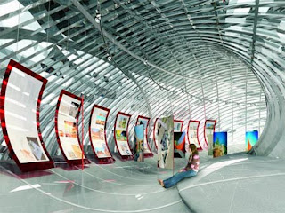
^^^Australian Virtual Pavillion, 2004, interior