Sunday, March 29, 2009

influential artist

For tuesday's colour lesson i have already decided on the artist that inspires me.
German Expressionism artist, Franz Marc's use of colour has always attracted me, even when his subject matter is a bit hard to compre
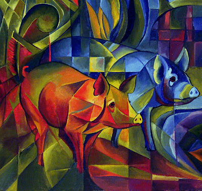
hend.

Wednesday, March 25, 2009

movie posters


As soon as this assignment was mentioned by thoughts immediately went to the movie Moulin Rouge, directed by Baz Luhrman and starring Nicolbe Kidman and Ewan McGregor.

This movie poster is a perfect example of an extremely effective use of text.

The strongest feature of the text is that it fits perfectly with the context of the film. Even without seeing the movie most people have some idea of what the Moulin Rouge is about-Dancing, Girls, Burlesque, eroticism, show business and so on.

The text example is strong and dominantly, blending into the composition easily. It fits the era the film is set in, as well as the context. It also helps to show to the audience what the film may be about along with the words "Truth, beauty, freedom, love." implying what to expect.

Even the background text of the lit up windmill, while part of the setting of the film, shows the context, emphasises the importance of the title (being repeated 3 times), and gains interest. Both text example are not the generic black font that you would find on most movie posters.

Everything about this poster works, it looks great, promotes the movie well and attracts viewers


However i can't say the same for this poster. Looking at this poster i immediately saw many things wrong with the text used.

#1 there is not enough focus on the actual title of the movie. from the size of the actress and the her name, it suggests that people should see the film because she is in in, rather than because it is a great film for everyone to see.


#2The colour scheme of red and orange is not very attractive, does not seem to fit in and if anything...reminds me of an American fast food chain. (the colours yellow and red make consumers feel hungry).

#3 that my judgement is biased because i have seen this movie and was not impressed and because i rarely am for any of Hilary duffs movies
While I should be looking more closely at architects i cant help thinking about an artist i saw in this weeks Thinking Fashion Lecture...

Georgie O'Keefe
Her artwork caught my attention straight away, simply from her use of colours (how she uses them, and against what other colours), the ambiguity of her subject matter; in that the viewer could see any thing in her works, and lastly because i believe that if if i was to become a visual artist, i feel that the type of art i would make would be very similar to hers.

Here are some of her works that appeal to me...


fun with photoshop

I can definately see a change in my new photoshop skills. I feel more comfortable using it and actually find it quite fun to create new designs and images. I still get quite frustrated with the program when i try something simple and yet it won't work, yet generally find that i've made a simple mistake or haven't looked at everything that needs to be considered.
the following are this weeks homework tasks which i actually found quite enjoyable


Sunday, March 22, 2009

I officially love photoshop now!!!
I'm slowly getting the hang of it, with all its thousands of applications

Starting with...


Adjusting the brightness, getting rid of all the unwanted lines around it

Added this image of fabric


Then added some colour and filled in all the details.

Cropped this onto this body


Adjusted the background, added some leaf embellishments, played around with some filters and wa-la!!!!
Scanning

Having no previous scanning skill other than putting the paper in and pressing scan...this exercise has been an interesting one. After the failure in uni scanners last week...I scanned the required images at home.

I will never understand it until someone sits down and talks me through the temperaments of scanners, but each scan can prove a different results. I have a Pixma MP800 at home, which is a very helpful machine involving easy scanning (by pressing one button) and a copyier and printer included. However while scanning the image of my DDS drawings (as can be seen below), the first attempt turned out well yet slanted, and the 2nd left me with a singluar section of the page. Needing the whole page, this was a frustration as it kept doing the same thing. After scanning the same page several times it finally gave me a whole page scan...without me changing any of the settings. Two things can be deducted from this experience
#1 I have no control over my scanner's results (unless I delve deep into the instruction manual)
and
#2 The scanner it self must be a very emotional, moody, unreliable old woman.

First scan (similiar to what the rest dud ones looked like)

The Scan I Needed: The printer i have at home does not have a descreen button so i am still yet to see the difference in a scan while using it.


Wednesday, March 4, 2009

Speaking of Architectonic

After hunting through the web for an architect whose works appealed to me I happened to come across a series of work from British fashion designer Molessa...

...As I mentioned before about the forms of futuristic architecture influencing silhouette's of fashion, the following collection can clearly rationalise the thought.


This collection was inspired by medieval clothing and Joan of Arc.
The architectual aspect of these pieces can clearly be seen in their structure forms, particularly evident around the hips.

The rose dress particularly fascinates me, considering the degree of skill the construction of it must involve.

Architectonic-beginnings

Tom Kovac
Di Stasio Virtual Pavilion
Beijing 2006

Born 1958 in Solvenia, Tom Kovac currently resides in Melboune, Australia

A quote i found on http://www.designboom.com/eng/interview/kovac.html

"...an adjunct professor at RMIT university, kovac`s teaching methodology complements this practice related research and experimental design direction, which covers a broad spectrum of design and creative a ctivities within the field of digital architecture and design..."


sums up Kovac individual design process and concept in
which he approaches architecture.


A similar design is the...

The Virtual Pavilion was Australia’s
unofficialb‘presence’ in the 2004
architecture
biennial in venice.
Australian Virtual Pavillion, 2004


Both these buildings portray Kovac's unique creativity in his approach to architecture.

The similarity of the two buildings suggests that Kovac has a fascination with extending the boundries of typical architecture of just 4 walls and a roof.

The shapes he creates are futurist, innovative and inspirational to all areas of design including fashion. The outside structure could easily translate to the structure of a stiffened blouse or bubble skirt.


^^^Australian Virtual Pavillion, 2004, back view


^^^Australian Virtual Pavillion, 2004, interior